

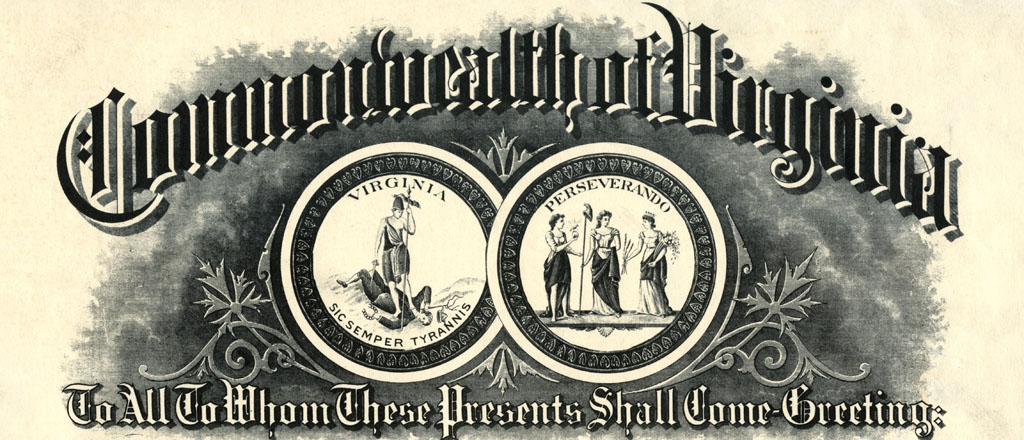
The design of the Seal of the Commonwealth of Virginia was adopted by the Virginia Convention on 5 July 1776, based on the work of a committee including George Mason, George Wythe, Richard Henry Lee, and Robert Carter Nicholas. Their design emphasized themes of civic virtue based on ancient Roman mythology, but it was not cast properly and over the years numerous variations sprang up. In 1930 a committee was formed, including the current Librarian of Virginia Dr. H. R. McIlwaine, to look into the situation and establish an official version of the great seal. As part of the work for that committee, McIlwaine collected a series of letterheads with variations of the Virginia seal on them. They differed wildly in their portrayal of the Roman goddess Virtus, the defeated tyrant, and even the background of the scene. The original text on letterheads by Vince Brooks is included here for context.


Commercial stationery can offer a fascinating snapshot of a place or time. Scholars of this subject point out that the rich illustrations and elaborate printing of commercial letterheads, billheads, and envelopes correspond with the dramatic rise in industrialization in America. According to one expert, the period 1860 to 1920 represents the heyday of commercial stationery, when Americans could see their growing nation reflected in the artwork on their bills and correspondence. As commercial artists influenced the job printing profession, the illustrations became more detailed and creative.
Robert Biggert, an authority on commercial stationery, wrote an extensive study of letterhead design for the Ephemera Society of America entitled “Architectural Vignettes on Commercial Stationery” and donated his personal collection of stationery, now known as the Biggert Collection, to the Avery Architectural and Fine Arts Library at Columbia University.
The primary role of these illustrations at the time of their use was publicity. The images showed bustling factories, busy street corners, and sturdy bank buildings–all portraying ideas of solidity, activity, and progress. Other types of symbolism can be found in commercial stationery, the most ubiquitous being “man’s best friend.” Dogs show up on all sorts of stationery, especially that of banks or other financial companies. Often seen is the illustration of the dog lying in front of a vault or safe, the “watch dog” meant to convey the idea of security. This becomes such a well-known image, that eventually only a dog’s head is needed on checks or envelopes to communicate this meaning.
Letterheads found in the various collections at the Library of Virginia, in addition to sometimes being entertaining, offer an excellent example of secondary research value, especially the stationery depicting buildings. These illustrations can often be the only visual representation of a structure now demolished and can be a great aid to architectural historians. Additionally, business historians and students of graphic design can find letterhead useful in their studies.
-Vincent Brooks, Senior Local Records Archivist
If you’d like to see more letterhead now, check out the Library’s historypin.


